The importance of rebranding in the development of Klaar.me
It has been a few months since Klaar.me launched its new name and corporate identity on the market. In Klaar.me, the rebranding project was led by Liis Laanesaar, head of operations and service development, and Kairit Kasepuu, CEO. The partner for developing the design, concept and story was the design studio BYNEW. The need for rebranding arose after the company fully transformed its existing accounting service and it was necessary to come up with a unique design and story for the new identity.
Liis Laanesaar says that there was no hesitation in spite of such massive changes. “We were convinced that we are on the right path and that we need a new bold visual identity and name to fulfil our bigger mission – to offer an entirely new level of accounting service,” she says. Ronald Uus, designer, creative strategist and CEO of BYNEW, adds that their team was impressed with the energy of Klaar.me and commitment to differ from competitors. “This created a basis for doing something quite different. For me it was very important that both Liis and Kairit wanted and were ready to contribute their time to participate in the creative process. They were actively involved in the creative part, while fully trusting us – I believe that this kind of cooperation gives good solutions and the new brand of Klaar.me is an excellent example of this,” says Uus.
Challenge: how to modernize an image based on stereotypes?
“Accounting and financial management are businesses which are normally associated with complex Excel spreadsheets, color-coded thick folders on shelves and grumpy poorly communicating bookkeepers working in boring grey offices,“ says Liis Laanesaar, adding passionately: “At Klaar.me we offer a totally different image. Our office at Uus-Veerenni is very modern and we have no shelves with folders and piles of invoices since all our accounting systems are electronic. If you visit us you will be surprised at how the whole atmosphere reminds the world of start-ups,” adds Laanesaar. “We wanted our new brand to emphasise the openness, innovation and freshness in everything that the all-female Klaar.me offers,” says Uus, adding: “And like the new brand of Klaar.me, we are innovative, friendly, modern and professional.”
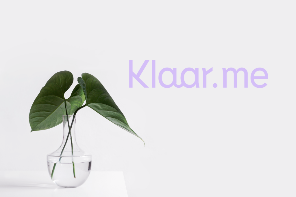
“Our visual identity reflects these keywords both in a small smile hidden in our logo and in the fresh-looking colour palette. It was also very important to find the right typeface that looks both professional and is powerful contrast to the pastel colours. As the whole brand was playful, we also created exciting wordplays with the name Klaar that we have uploaded on our webpage. The reason why we chose this word for the name (in Estonian, “klaar” means “clear”) was to emphasize the transparency of our services. It means that the customers can at any time log into their account and get an overview of the state of affairs. In addition to creative wordplays it was important that the service packages displayed on the website are clearly structured and presented. We also wanted to show the people who are behind Klaar.me. At the end of the day you need to have total trust in your accounting service provider and without transparency it cannot be done,” adds Uus.
Result: customers now find Klaar.me themselves
RoRonald Uus says that rebranding itself will not make a business grow. For that to happen the company must have a good product or service, and a strong brand will give the company self-confidence and a reliable image so it can tell its story and sell to customers.
“Me oleme hea näide elust enesest, et head brändi koos kvaliteetse sisulise poole, ägeda väljanägemise ja õigete “We are a good example of how a good brand together with quality content, modern image and the right values help sales,” says Laanesaar. “While previously about 95% of our new customers were recommended by our existing customers, there are now more and more customers who have googled us and discovered our homepage,” she adds. “I am very happy as it demonstrates that BYNEW did a great job in giving us an image that embodies our essence, that people relate to and that attracts new customers. “As head of development, I can now streamline our work processes to increase the efficiency of the workflow for us and our customers. I lookforward with excitement to developing our work processes,” says Laanesaar with optimism.