Values and brand identity of Klaar.me
2020 was a significant year for us, as the company got a completely new name and brand identity – Klaar.me. This was preceded by a long but extremely exciting and creative cooperation with the creative team of BYNEW.
Our goal was to ensure that the new brand identity and content reflect our essence. We looked deeply into our own nature and processes and described how we see ourselves and what the key values for us are.
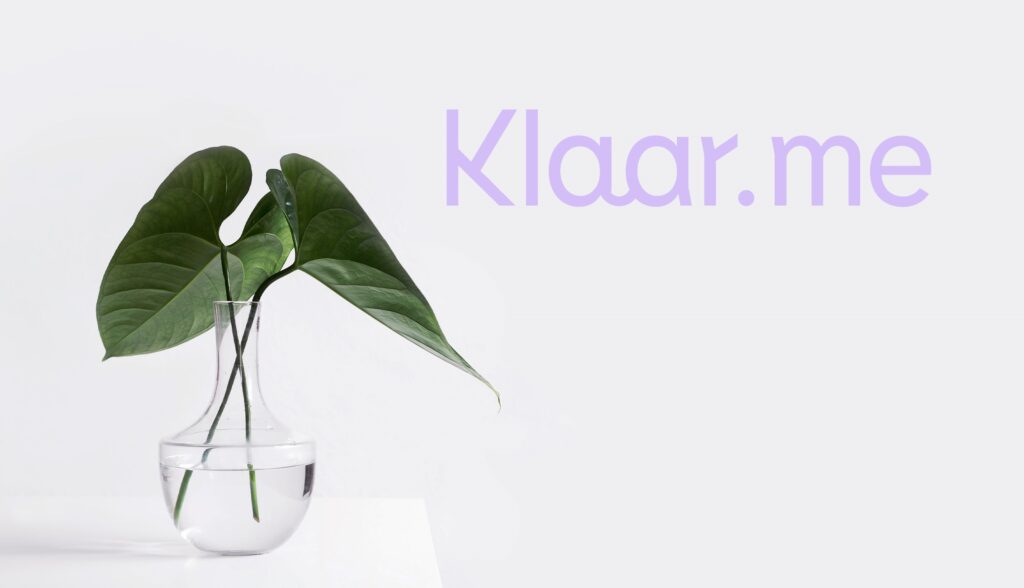
And so we came up with a great name – Klaar.me. It best conveys our values: KLAAR (CLARITY) – transparency, openness; ME – cooperation, efficiency. In addition, the name sounds very good in English and allows wordplay with the word clear.
Klaar.me is a mixture of Estonian and English language, and should be pronounced [klɑːr miː].

Our values
TRANSPARENCY
We value free and open communication and talk about things as they are. As our accounting processes are clear and transparent, this is also reflected in the financial snapshot of our customers.
OPENNESS
We focus on openness and transparency in our work. We consider open communication with each other and with the customer very important, because we are convinced that if we want to solve the problem, we first need to talk about the problem.
COOPERATION
Our goal is to work with the customer as one team and to be not only a service provider, but a financial partner. We work to reduce inefficiencies in accounting processes and focus on activities that create value for the customer.
EFFICIENCY
We value our time and the time of our customers, and have therefore developed a system that turns our customers’ accounting processes into a logical and simple system.
Our brand identity
To take these values and shape them into a single visual form is nothing short of design art magic. But the BYNEW team did it with playful ease, and the result – our own font, colours and logo – is really who we are!
For the most part, our brand has warm colours, which expresses our credibility and friendliness. Yet it is also accented by bolder and fresher tones that go hand in hand with our innovative way of thinking and courage.
Who would have thought that it would take so long to come up with the right font? We and the BYNEW team wanted the font to be perfect and, most importantly, unique. Fortunately, we came up with Lemur, a font that was created only a few years ago and stands out for its geometric structure. This, in turn, works perfectly with the overall visual language, which is very clean but rather soft – it adds character!
As for the logo, it was especially important to create a friendly but professional effect. The geometric letter K and the clean font convey it perfectly. We are especially happy with one little twist – namely, our logo includes a small smiley at the junction of the letters a. Now take a look at our brand new website and see if you can find this playful design twist.